Crafting a Royal Legacy: The Brand Identity of Raya Infra
I crafted Raya Infra's brand identity to reflect their vision of being the gold standard in real estate, synonymous with royalty, trust, and exceptional living. The brand was designed to convey their commitment to building not just houses, but legacies, and their position as the kings of real estate. It is a combination of powerful color schemes and elegant typography to enhance their brand's unique message.

Kondapur, Hyderabad
2023
Real Estate
5+
Challenge
Raya Infra approached me with the vision of being recognized as the gold standard in real estate, but lacked a brand identity to convey their vision.
My goal was to translate this vision into a powerful brand identity that reflected their commitment to building not just houses, but homes, and also communicating their strong foundation, unwavering reliability, and excellent services.
Results
The final brand has a powerful, memorable and timeless feel, aligning with Raya Infra’s values, and mission.
The visual identity—logo, color palette, and typography—effectively conveyed Raya Infra’s aspiration to be recognized as the 'Kings of Real Estate.
Process
Research & Analysis: I started by researching Raya Infra’s vision, values, and mission and the industry that they are in. I wanted to see how we can make Raya stand out. The main focus was to create a brand that was synonymous with royalty, trust, and exceptional living.

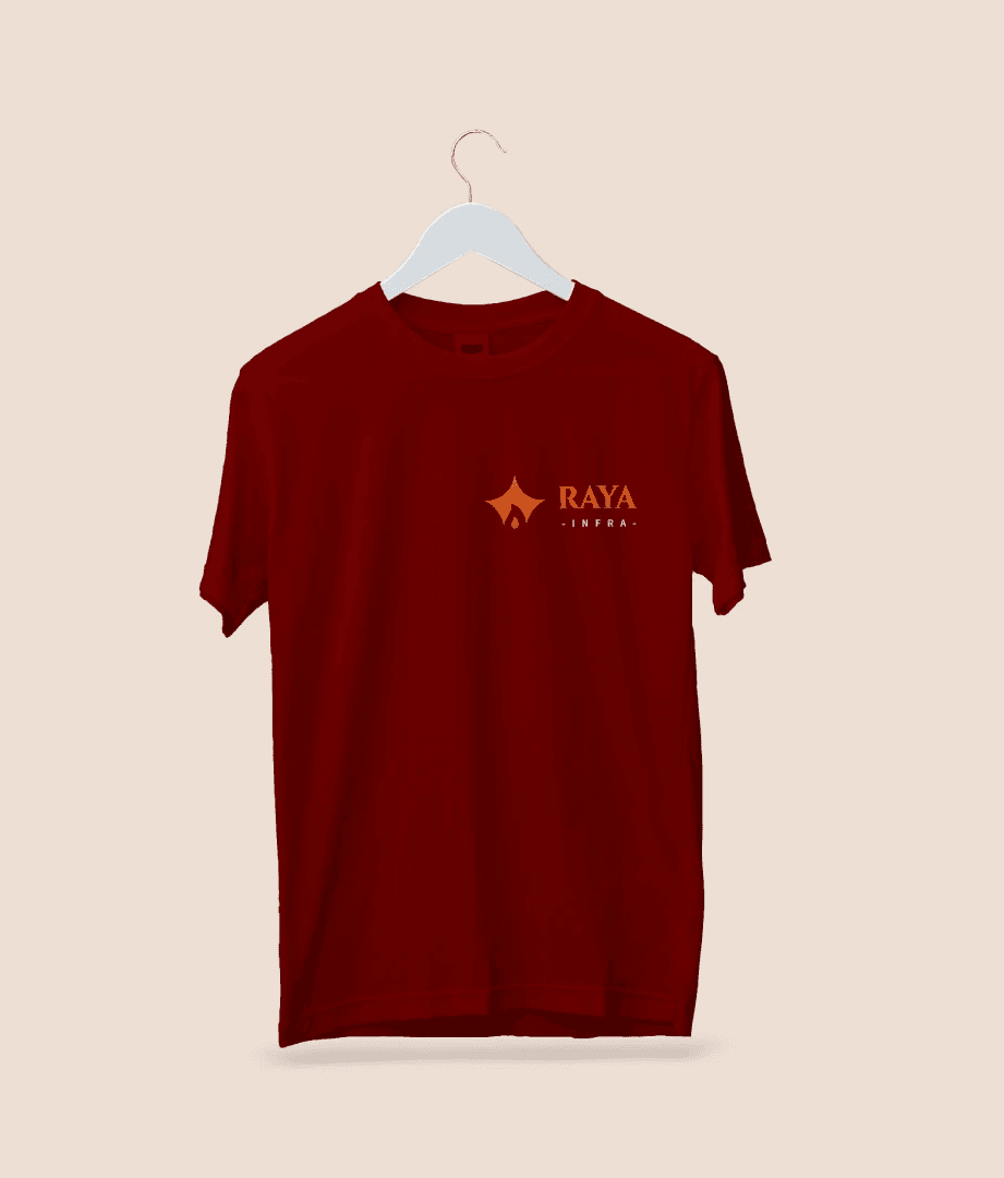
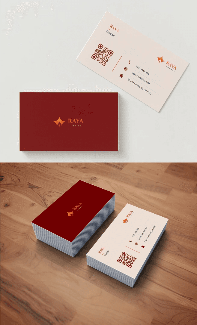
Logo Development: The logo combines a crown, flame, house and a bridge, each representing a different aspect of Raya Infra’s values: leadership, passion, security, and connectivity. The combination is a unique, modern, and timeless design. The logo is designed to be memorable, powerful and elegant.

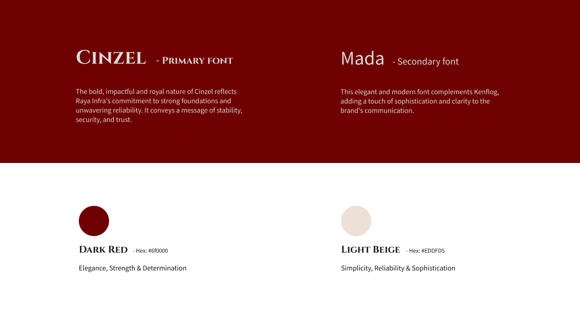
Color Palette & Typography: I chose Dark Red to represent elegance, strength, and determination, and Light Beige for simplicity, reliability, and sophistication. The color palette is designed to be luxurious, bold and powerful. The choice of color emphasizes the brand's royal position in the industry. Cenzel, the primary font, is a bold and impactful font that conveys stability, security, and trust, reflecting Raya Infra’s commitment to strong foundations. Mada, the secondary font, is elegant and modern, adding a touch of sophistication and clarity. These two font families complement each other to create a sophisticated look.
Brand Messaging: The overall brand message aimed to position Raya Infra as a company that builds not just houses but homes, with a touch of sophistication and modernism. The brand messaging focuses on the emotional connection and the legacy that is built.

Conclusion
This project taught me how to visually communicate a brand’s core values and vision. The use of strategic elements such as logo, typography and color palettes played a key role in making the brand more impactful. A well-crafted brand will create a strong market presence and make the brand easily recognizable.
I’m super proud of the Raya Infra brand for how it embodies the client’s vision and commitment to excellence. The brand is powerful, timeless and modern, capturing the essence of what Raya stands for. This project has cemented my belief in design's transformative power. I’m excited to create other timeless brands.