Building a Brand for Connection: The Visual Identity of SociallOne
I developed SociallOne's brand identity from the ground up, focusing on creating a visual language that conveys connectivity, unity, and completeness, while being trustworthy and innovative. The brand represents what the product is all about. It is designed to stand out in the social media management landscape and be easily recognizable.

Kondapur, Hyderabad
2023
Marketing
5+
Challenge
SociallOne needed a strong brand identity that resonated with its core values and differentiated it from other social media management tools.
My goal was to create a brand that embodied connectivity, unity, and completeness, reflecting the app's mission to simplify social media management, while maintaining a sense of trust, reliability, innovation and creativity.
Results
The SociallOne logo has become the face of the product. The investors praised the logo as one of the most attractive and modern logos. The product branding became the brand that helps in increasing the product recognition.
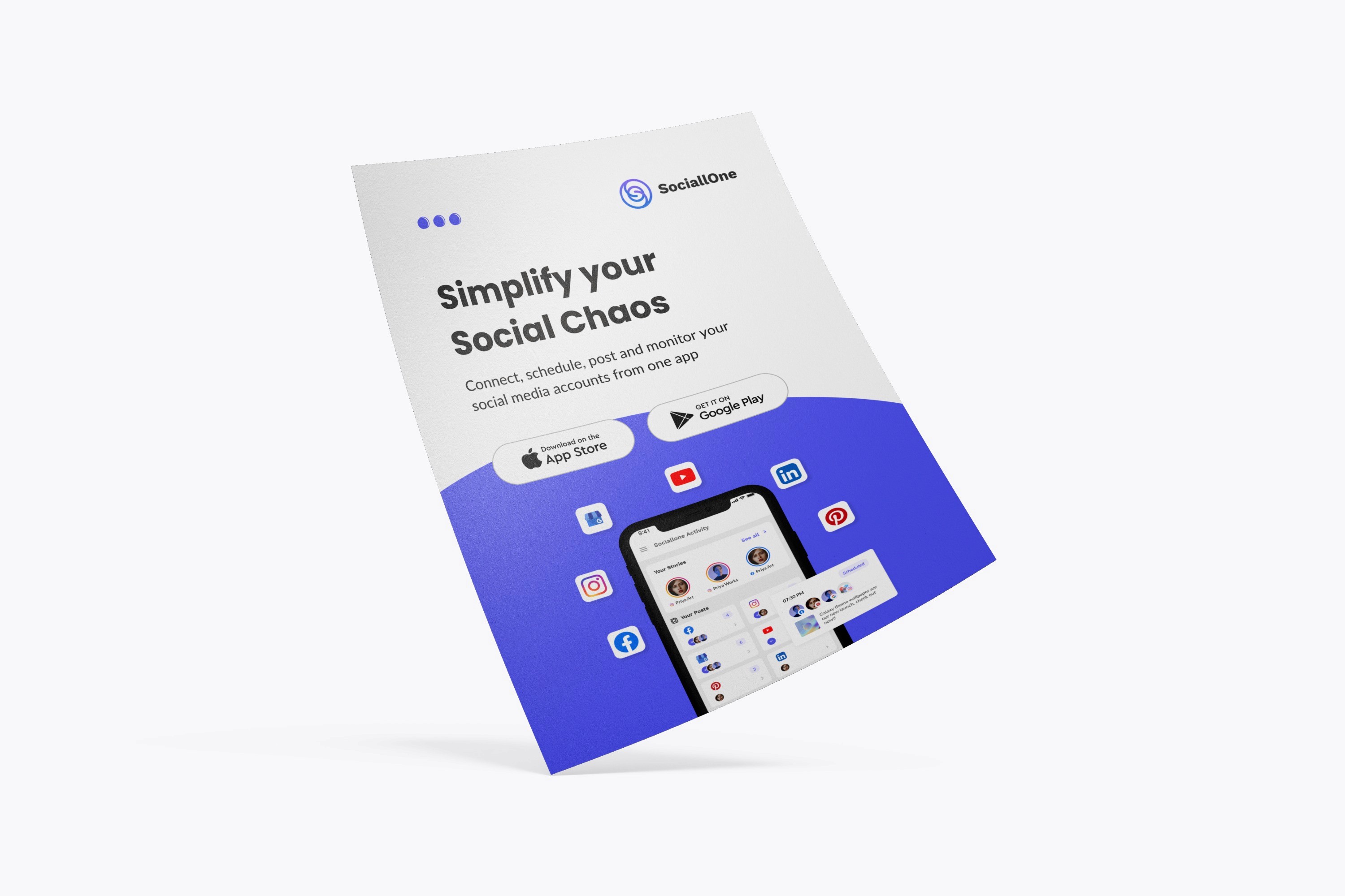
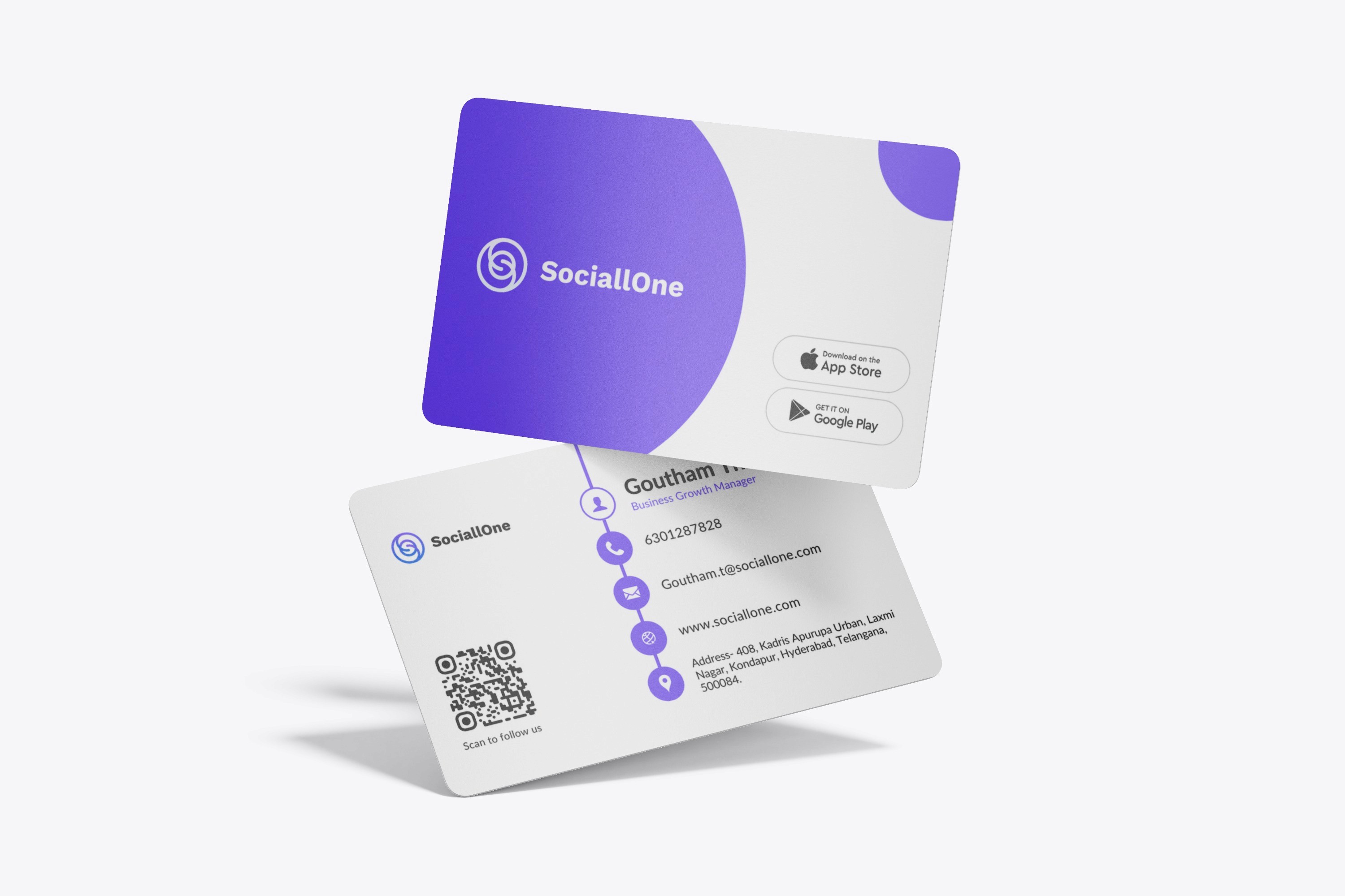
The brand identity is designed to be modern, approachable, and professional. The logo, colors, and typography work together to convey trust, innovation, and creativity.
Process
Research & Analysis: I began by identifying SociallOne's core values: connectivity, unity, and completeness. The goal was to visually represent these concepts in a way that felt both modern and timeless. I also looked at the different brands that were in the social media management space to see their strengths and weaknesses.
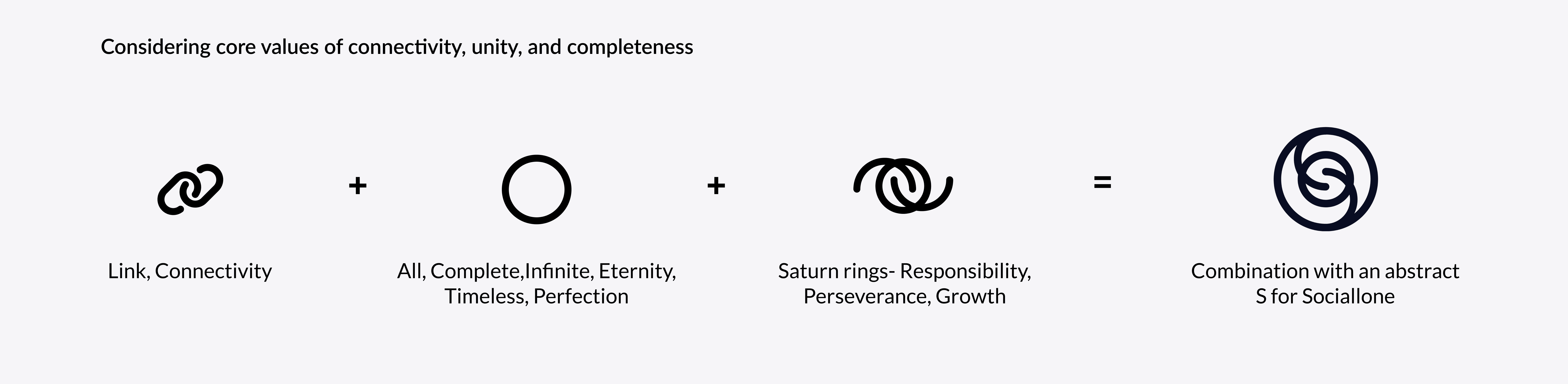
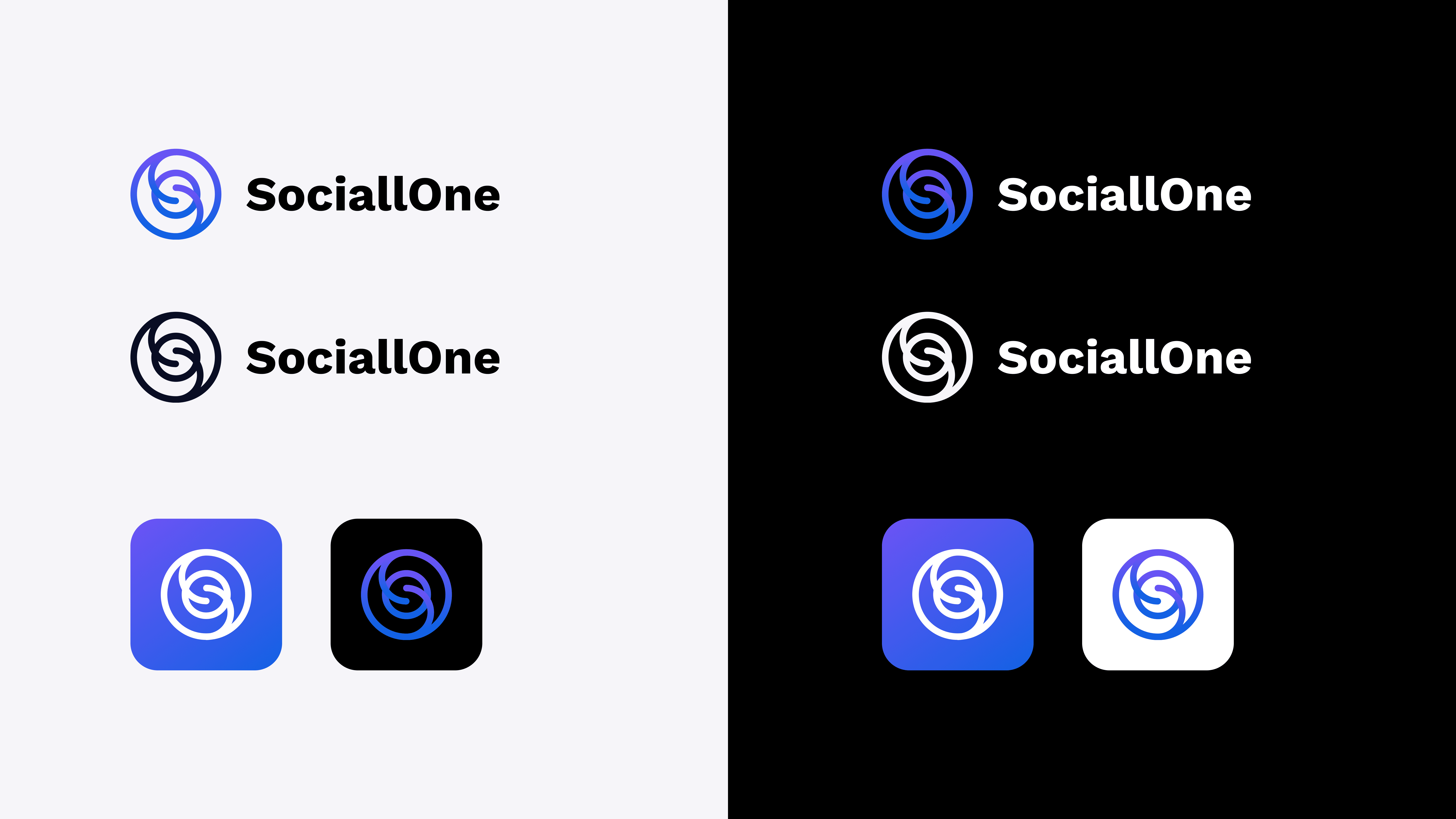
Logo Development: The logo was designed by combining a link, a circle, and saturn rings. The abstract ‘S’ was created as a central icon. These rounded shapes send a positive message of harmony and protection. The design was created to represent connectivity, and completeness. The ‘S’ design is unique, memorable and modern.
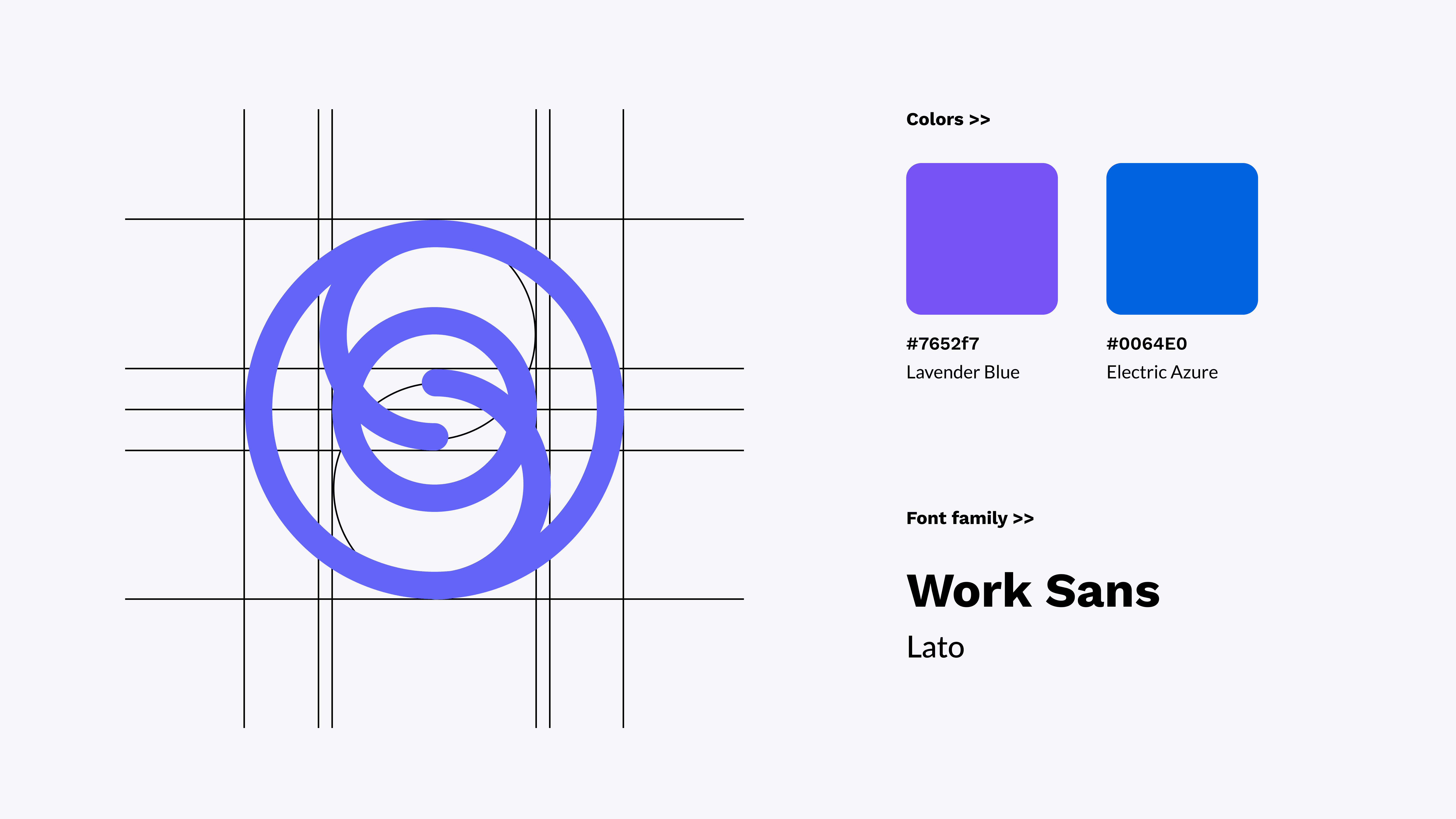
Color Palette & Typography: I chose Electric Azure (blue) to represent trust and reliability, and Purple to embody creativity and sophistication. The combination symbolizes SociallOne's dedication to dependable innovation in social media management. The font family was chosen to be Work Sans and Lato, which are both clean, modern, and highly readable, ensuring accessibility and clear communication.
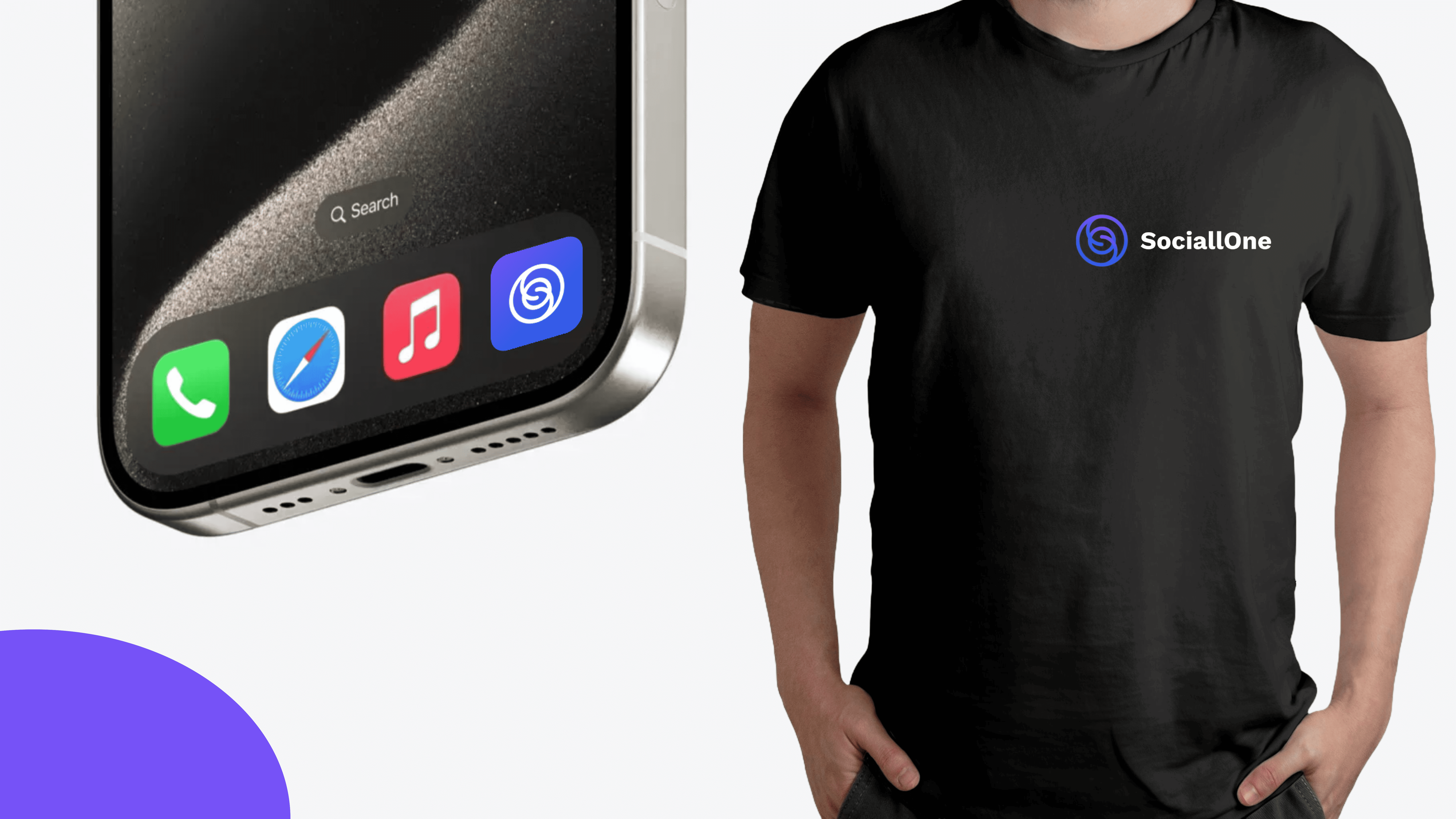
Visual Language: The overall visual language incorporated rounded shapes to evoke a sense of harmony and connection. The aim was to create a consistent, modern, and approachable feel across all touchpoints.
Conclusion
This project demonstrated how powerful a well-defined brand identity can be in creating a strong market presence. Creating a brand that represents a product to the core is a must for all companies.
I’m thrilled with how the SociallOne brand captures the essence of the product, making it memorable, modern, and meaningful. I’m proud of the brand as it’s the face of the product.